Read Part 1 of this article to learn about the purpose of charts in Forex trading, different chart types, and how to use line charts.
Bar Charts (OHLC)
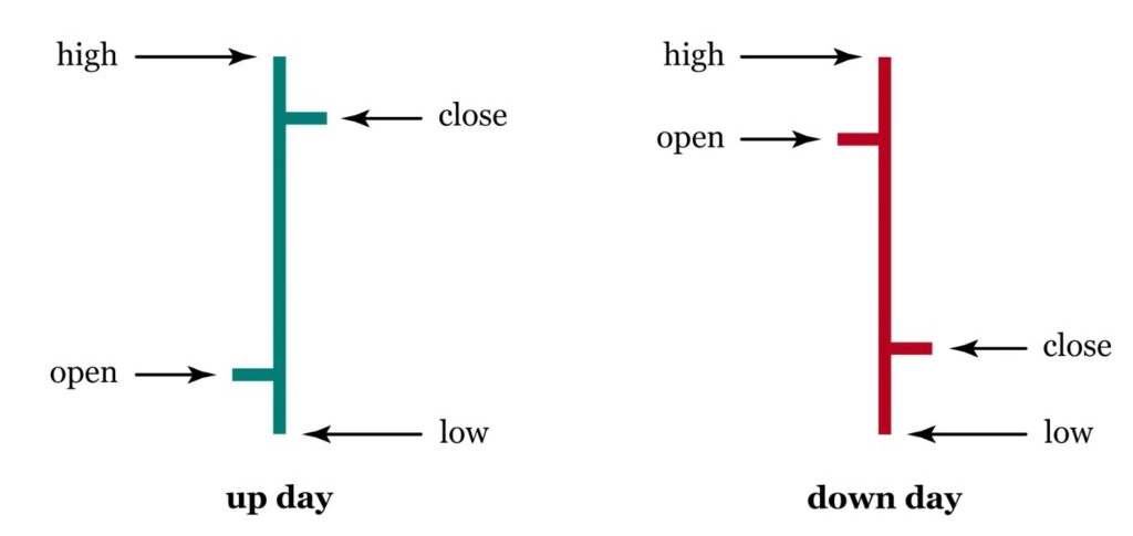
OHLC stands for Open, High, Low, and Close. Bar charts are a widely used type of Forex chart that display these four key price points for each time period. They are represented as vertical bars, and each bar provides a comprehensive view of price movements within that specific timeframe.
Here’s a breakdown of the components of a bar on a bar chart:
Open Price: The top of the vertical bar represents the opening price of the currency pair at the beginning of the chosen time period.
High Price: The top point or “spike” of the vertical bar indicates the highest price reached during that time period.
Low Price: The lowest point or “dip” of the vertical bar represents the lowest price reached during that time period.
Close Price: The bottom of the vertical bar represents the closing price of the currency pair at the end of the chosen time period.
Bar charts are valuable for traders who want a more detailed understanding of price movements. They provide a holistic picture of what happened within a given timeframe.
source: Britannica
How to Read and InterpretBar Charts
Reading and interpreting a bar chart involves analysing each bar to understand the dynamics of the market during that specific time period. Here’s how you can read and interpret a bar chart:
Open to Close: The vertical length of the bar represents the price range between the opening and closing prices for that period. A longer bar indicates a larger price range.
High and Low: The “spike” at the top and the “dip” at the bottom of the bar show the highest and lowest prices reached during the period.
Market Sentiment: Analysing the relationship between the opening and closing prices can help you gauge market sentiment. If the closing price is higher than the opening price, it suggests bullish sentiment (buying pressure). Conversely, if the closing price is lower than the opening price, it indicates bearish sentiment (selling pressure).
Patterns and Trends: By observing patterns in multiple bars, traders can identify trends, reversals, and potential trading opportunities.
In summary, bar charts are a powerful tool for traders seeking detailed insights into price movements. While they may seem complex at first, they are worth exploring as you gain experience in Forex trading.
Candlestick Charts
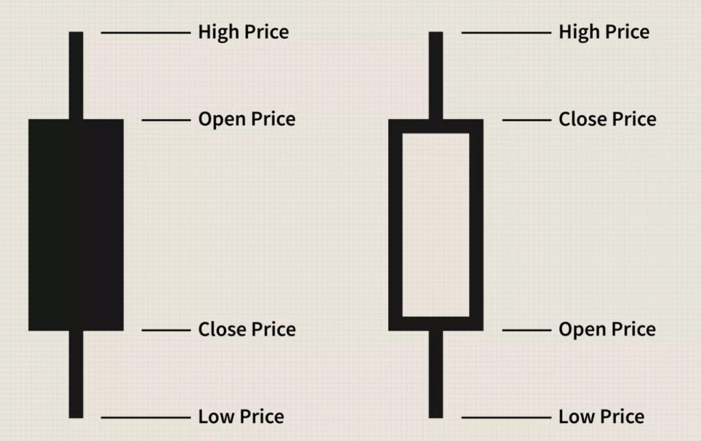
Candlestick charts are a highly visual and popular way to represent price movements in Forex trading. They use “candles” to provide a comprehensive view of the opening, high, low, and closing prices within a specific timeframe.
Here’s a breakdown of the key elements of a candlestick:
Body: The central and thicker part of the candlestick is known as the “body.” The body represents the price range between the opening and closing prices for the given time period.
Wicks or Shadows: Thin lines extending above and below the body are called “wicks” or “shadows.” These wicks represent the highest and lowest prices reached during the same time period.
Colour: Candlestick charts use colour to convey valuable information about price movement during the timeframe. Typically, candles are coloured green or red, but this can vary depending on your chart settings and platform.
source: investopedia.com
How to Read and InterpretCandlestick Charts
Reading and interpreting candlestick charts involve understanding the relationship between the body, wicks, and their colours. Here’s how you can read and interpret a candlestick:
Body and Wick Length: The length of the body and the wicks provides insights into price volatility. A longer body or wick signifies greater price movement during the timeframe.
Green (Bullish) and Red (Bearish): In most cases, a green (or white) candle represents a bullish candlestick, indicating that the closing price is higher than the opening price. Conversely, a red (or black) candle represents a bearish candlestick, signifying that the closing price is lower than the opening price.
Upper and Lower Shadows: The upper shadow extends from the top of the body to the high price, while the lower shadow extends from the bottom of the body to the low price. These shadows illustrate the price range’s extremes during the timeframe.
Patterns: Candlestick charts are renowned for their ability to reveal specific patterns, such as doji, hammer, and engulfing patterns. Traders often use these patterns to predict market reversals or continuations.
In summary, candlestick charts are a powerful tool for traders seeking a visually engaging way to analyse price movements. Their ability to reveal patterns and market sentiment makes them a favourite among traders, but mastering their interpretation may require some practice and education.
Timeframes and Charting Periods
Forex charts can be customised to display price data at various timeframes. The timeframe you choose determines how much data each candlestick or bar represents. Here are some common timeframes:
1-Minute: Each candlestick or bar represents one minute of trading data. This timeframe is popular among day traders for making quick decisions.
5-Minute: Each candlestick or bar represents five minutes of trading data. It provides a slightly broader view than the 1-minute timeframe while still catering to short-term traders.
1-Hour: Each candlestick or bar represents one hour of trading data. This timeframe is suitable for traders who want to capture short- to medium-term price movements.
4-Hour: Each candlestick or bar represents four hours of trading data. It’s commonly used by swing traders and provides a more extended perspective of the market.
Daily: Each candlestick or bar represents one full trading day. Daily charts are favoured by long-term traders and investors who want to identify significant trends and potential entry points over several days or weeks.
Weekly: Each candlestick or bar represents one trading week, making it ideal for traders with long-term investment horizons who aim to capture trends over months or even years.
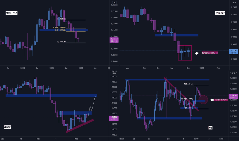
Multi time frame analysis source: tradingview.com
Choosing the Right Timeframe
Selecting the appropriate timeframe is a crucial decision that depends on your trading style, goals, and preferences. It impacts the type of price movements you observe and the duration of your trades. By aligning your timeframe with your trading style and objectives, you can make more informed decisions and enhance your overall trading success.
Here are some considerations:
Short-Term Traders: If you’re a day trader or scalper looking for quick profits from short-term price fluctuations, lower timeframes like 1-minute or 5-minute charts may be more suitable.
Medium-Term Traders: Traders with a medium-term horizon, such as swing traders, often use 1-hour or 4-hour charts to capture price movements that span a few days to a few weeks.
Long-Term Investors: If you’re an investor or trader focused on long-term trends, daily or weekly charts provide a broader view of the market and are better suited for identifying significant trends and potential entry points over a more extended period.
Combination: Some traders use a combination of timeframes to gain different perspectives on the same currency pair. For example, they might use a daily chart for trend analysis and a 1-hour chart for precise entry and exit points.
In conclusion, Forex charts are indispensable tools in the currency trading world, offering clarity amid market complexity. Whether you choose line, bar, or candlestick charts, your chart type significantly impacts your trading strategy. Understanding various timeframes is key for aligning your trading style with your goals. As you dive into trading, remember that chart analysis is a skill to refine, guiding you to profitable decisions and financial growth.